
Brief
IBM App Connect is application integration software that connects applications and data sources, plus the ability to create custom connectors. In simpler terms, this software creates a system that allows users to create automations between applications and data. "Logs" refer to the system logging system where all instances of change, error and debugs are recorded.

Design Process
In order for this project to run smoothly and cover all bases, I adopted a six step process, which aligns with a design process used in industry:
Empathise
Research Insights
Define
Problem Statement
User-Personas
Ideate
Sketches
Mid-Fidelity
Design
High Fidelity
Visuals
Iterations
Critic Sessions
PM Playbacks
Implementation
Handover Document
Development
Project Timeline

Empathise
I started by conducting a thorough audit of the log-viewer page to kick off my research into the project. Initially, I identified several design flaws affecting the user flow, and I cross-referenced these with user-testing results to ensure every aspect and function of the page was evaluated. Additionally, I reached out to the Software Architect who owns this feature. We went into detail about the support call increase the page had triggered. From our conversation, I was able to create an idea of what issues were leading the failure of this design.
Additionally, I leveraged this session to gather as much about the feature as I could, aiming to devise the most effective solution but also improve other features along the way. From our conversation, I was able to create a breakdown where I labelled the columns by its action, how it’s populated, and how the user utilises the information to diagnose an error. This process helped me overcome barriers such as potential misunderstandings of the terminology used within App Connect and the function of the logs. Without this meeting, my comprehension would have been significantly different.
User-Personas
In making sure this design was effective for it's target audience, I paid attention to the user-personas that were created by the research team. We use these user-personas in every piece of work we do. Our briefs are often problem statements with "As Sarah" or "As Mike" to keep our work user-focused. I was taught Enterprise Design Thinking at IBM, achieving a badge as practitioner and co-creator, this allows me to utilise design thinking strategies; such as using empathy maps to understand how our target user is feeling, thinking, saying and doing while using our products. This helps us, as designers, cover a whole array of problems and possibly uncover something we have overlooked. Another, is As-if scenarios where we pay attention to the feeling, thinking, doing and saying at certain points of the user-experience, called phases. At the end of these sessions, we group them together (if we can) to impact a wider issue.

Design Thinking | Empathy Mapping
In making sure this design was effective for it's target audience, I paid attention to the user-personas that were created by the research team. We use these user-personas in every piece of work we do. Our briefs are often problem statements with "As Sarah" or "As Mike" to keep our work user-focused. I was taught Enterprise Design Thinking at IBM, achieving a badge as practitioner and co-creator, this allows me to utilise design thinking strategies; such as using empathy maps to understand how our target user is feeling, thinking, saying and doing while using our products. This helps us, as designers, cover a whole array of problems and possibly uncover something we have overlooked.


Design Thinking | As-Is
Another, is As-if scenarios where we pay attention to the feeling, thinking, doing and saying at certain points of the user-experience, called phases. At the end of these sessions, we group them together (if we can) to impact a wider issue.


Define
After synthesising the insights from my empathy maps and user research, I created a problem statement that summarised the conflict for users. This stage focused on translating qualitative findings into actionable design solutions.
Problem Statement:
"As Sarah, I want to be able to filter logs by integration runtime so that I can more easily diagnose issues using the built in log viewer."
Ideate
I pulled the team together for a sketching session, bringing this design issue to the team. Sketching this way encourages us as designers not to fear getting ideas down, bad or good. It also encourages us to generate ideas sustainably as we are not using resources like paper or technology. We have often conducted these sessions remotely on Miro to reduce our carbon footprint.

This session was a success, the ideas generated were great and all different from each other (a lot of the time sketches can be very similar from being in the same meetings and digesting the same information). Each designer stood up and talked through their sketch, we gave time for feedback which generates a good discussion, more ideas are usually generated around this which is why we like to post-it down any ideas mentioned.
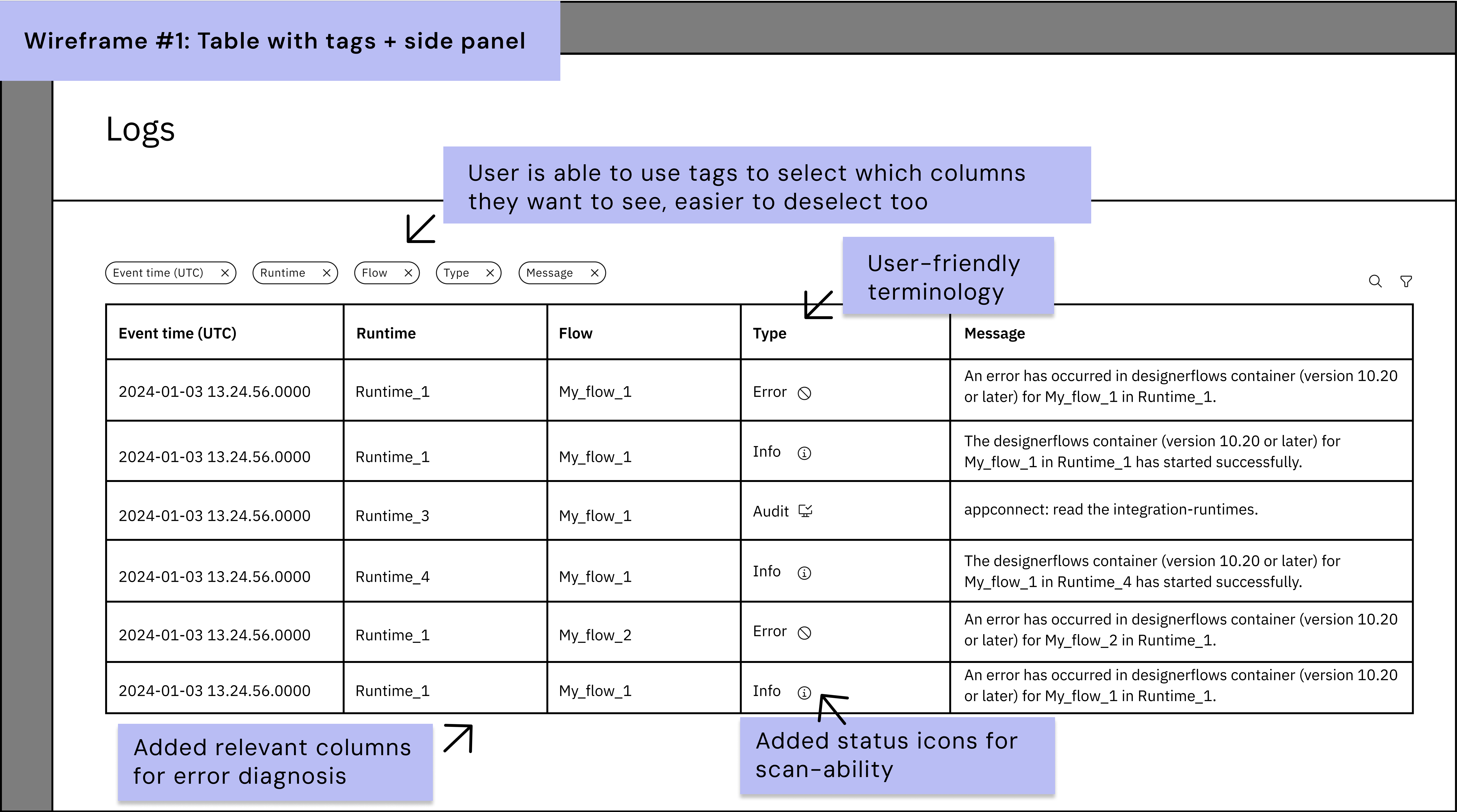
At the end of the session, the sketching host will record sketches, bring all the ideas mentioned and sort through the most common themes. For this issue, I noticed a theme of: being able to hide/show columns, adding error status icons and adding a side panel for more information that is not particularly helpful inside the table. We all agreed that changing the terms would be better for easier understanding, especially for our user-persona Sarah. Finally, grouping issues in some way would be beneficial to lower the cognitive load for the user.

Low-Fidelity Sketches:
From the collaborative sketching session I started designing a few low-fidelity sketches. These all implemented potential explored solutions explored in the session.


Iteration | Critic Session
I presented these three ideas to my team in our critic session. Critic sessions are non-judgemental spaces where we can talk through our designs to get feedback on. At IBM, their design thinking strategy is the Loop, this is where you are circling round to get feedback, called Playbacks, at every stage of in design process. There were a few designers absent for the sketching session who were able to attend the critic session which was great for input from fresh eyes. In this session I demonstrated each idea, the user-journey and allowed time between each idea to gather feedback.
.png)
Mid-fidelity Wireframes
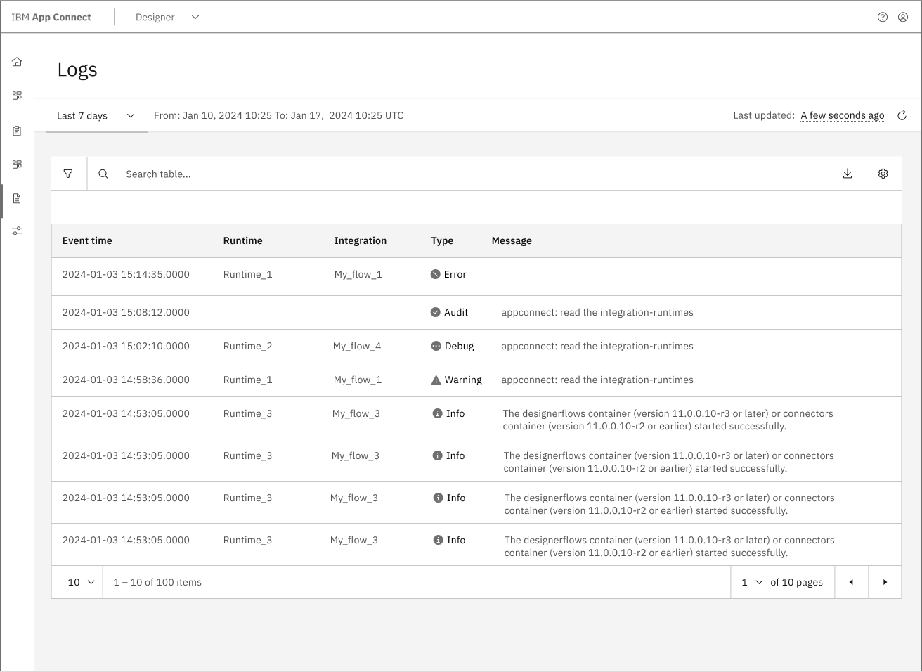
From the peer feedback, I was able to combine the concepts and produce an idea with the next level of quality: mid-fidelity. The Carbon Design System library provides this; all in grey-scale helps to minimise the emphasis on colour and fine details - this will come later. This stage enables you to get a more realistic picture of the concept design and help you to fine tune the components required.

As you can see above, included a page header for design consistency across IBM products. A once floating page refresh button is now sitting inside the page header for better page structure and grouping. The settings button has been redesigned into a table configuration panel allowing users to customise the displayed columns. This includes filtering tags and roles where the user may exclude entries with tags. When the user clicks on a row, a log analysis side panel displays relevant details that may be hidden when a user uses the column customisation and now includes the code which formerly sat inside the expanded row.
Last but not least, I wanted to incorporate an improved time-picker that sits in the page header panel; opposite the refresh button which groups the similar items together. Bringing this design idea I Implemented for App Connect's monitoring epic, it would support product consistency; this is important as users get familiar to where features are placed and behave, it is not recommended to have different page structures within the same product as users will spend more time adjusting (Yablonski, n.d.). I developed these concepts for a meeting with the product's stakeholders which takes me to my next stage in this process.
Iteration | Stakeholder Feedback:
About ten to fifteen product managers and engineers attended the meeting to provide extra input; whether the idea is feasible for the timeframe and permission to move forward onto the next phases.

High-Fidelity Wireframes

Dark/Light Mode
To support all designers, UXray includes a dark mode option. This helps reduce eye strain and aligns with the minimal, non-disruptive experience. The toggle is easily accessible, ensuring that switching themes doesn’t interrupt Jordan's workflow.
Projects
All of Jordan’s designs are inside Projects. The interface mirrors the “Recents” section on the Dashboard, intentionally, allowing Jordan access to project insights from either location. However, unlike the Dashboard, the Projects screen gives her full overview, including past work, and the ability to edit project titles.
Database
Regulations are broken down into digestible summaries and saved bookmarks. This aligns with both personas’ needs: helping Jordan stay up to date and bookmarking any regulations she may need to forward onto to her PM, and subsequently Eric, the CEO.
Learn
Regulations are broken down into digestible summaries and saved bookmarks. This aligns with both personas’ needs: helping Jordan stay up to date and bookmarking any regulations she may need to forward onto to her PM, and subsequently Eric, the CEO.
Dark Pattern Quiz
An example of the Learn feature inside the software. It supports our 'empower, don’t shame' principle by providing a fun, gamified approach to ethical design education.
Visuals & Document Prepartion

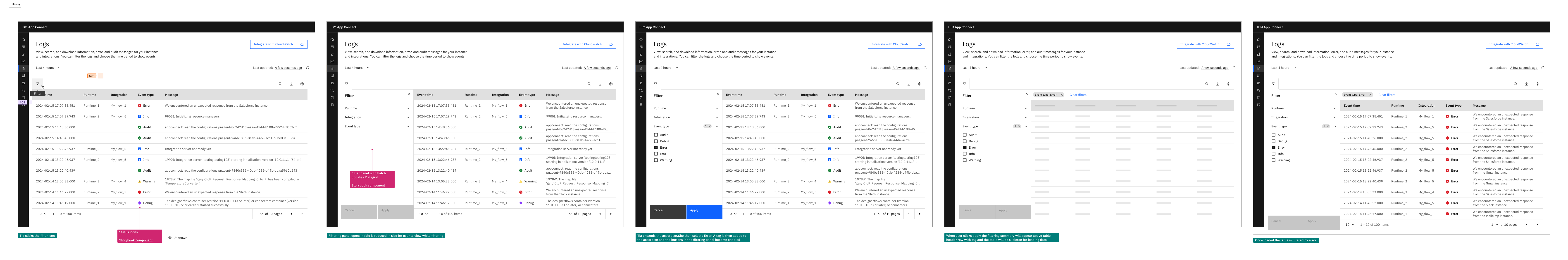
The document was organised with a flow of screens that addressed how the features should behave. The redlining process, which prepares the document for the development team, is a visual designers task which involves preparing the screens with any visuals aids that help the development team produce the designs perfectly. The process of redlining involves the placement of space markers (as you can see in the image above, $05 indicates that the gap should be 16 pixels) and using magenta annotations for notes. These annotations include the name of the component as well as the storybook link, which is a sandbox where the code is live. This allows the development team play with the code of the component is required for this design. You can see that I have prepared the document for skeleton loading, empty states, and hover states. This is done to ensure that the design is implemented precisely as we intended it to be. In order to avoid any confusion and delays in the handover process, it is important to be thorough with the documents.
When the visual handover was completed, I scheduled a meeting with the development team that is addressing this undertaking this epic. During this meeting, I went through all of these screens, addressing any significant details and answering any questions that the team may have. After a few weeks has passed since the team has begun working together, we hold regular meetings to ensure that the designs are being implemented appropriately and to address any concerns that the development team may have regarding the designs that have been proposed.
A close-out meeting was held by my team after the development team had finished this piece of work. During this meeting, they signed off on this work. Unfortunately, I was not present for this meeting because I had already finished my internship.

